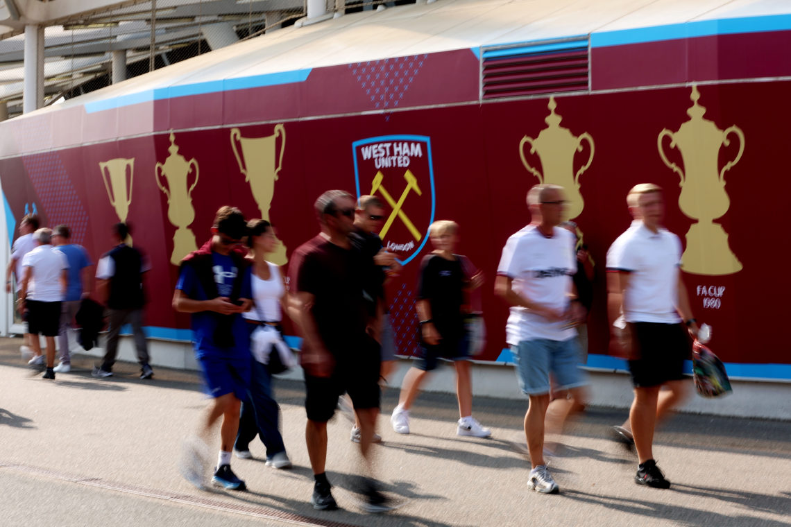


It doesn’t take much for West Ham fans to turn on the club’s board – and that’s exactly what has happened after the new home kit was officially revealed.
West Ham have launched their new 2025-26 season home strip – and it’s fair to say supporters are far from happy.
This is Umbro’s final season before being replaced by New Balance next summer.
And it won’t be a tough act to follow given the overwhelmingly disgusted reaction to the release of the new home kit.
Umbro had the honour of designing what is West Ham’s 130th anniversary kit.
West Ham fans demand answers from board over new kit
But supporters feel the firm have showed a complete lack of respect for West Ham’s history and kit traditions with what’s been branded by many fans as a ‘lazy’ effort.
West Ham introduced the strip to fans as a ‘clean, minimalist aesthetic’ for the new Premier League campaign.
“The shirt features a full Claret body with Blue detailing, while including a Claret and Blue striped rib V-collar and matching cuffs alongside the logos of our new Principal Partner BOYLE Sports and Sleeve Partner Intuit QuickBooks,” West Ham said.
“The 2025/26 shirt reinstates the full-colour club crest, with the iconic Crossed Hammers detailed on the back of neck, putting the finishing touches on a true modern classic in the making.”
But the problem is, fans have railed against all the features the club are heralding.
The vast majority of West Ham fans have slammed the fact the shirt does not have the traditional blue sleeves and dislike the badge change to the traditional colours, in lieu of colour matching with the piping of previous seasons.
Many now feel the badge colour jars and sticks out like a sore thumb against the nearly all-claret shirt.
Hammers fans savage new final Umbro home shirt as ‘worst ever’
Most damning of all, though, is that Hammers fans feel Umbro have even got the colour wrong – with many likening it to a Heart of Midlothian strip.
While not Umbro’s fault, supporters also despise the new Boyle Sports logo – which many feel is far too large – and the fact the QuickBooks logo continues in bright green.
Hammers fans have savaged Umbro’s final kit, demanding answers from vice-chair Karren Brady and the board as to ‘who signed the new kit off’.
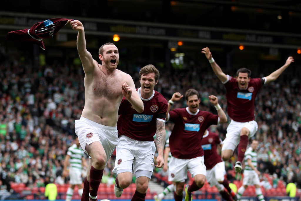
‘It looks like it is a kit for Hearts’
As well as likening it to a Hearts strip, a large number of disgruntled fans are all saying the same thing about the new kit; ‘it looks like a relegation shirt’.
Here is a selection of comments from West Ham fans on the club’s new 2025-26 home kit:
West Ham fan Tez was baffled by how bad the kit looks, saying: “What an awful shirt that is. Not even worth 20 quid let alone the amount they’re going to charge.”
https://x.com/TezzyWHU/status/1940686981668974895Irons supporter Damien Murphy said: “Looks like a championship kit.”
To which fellow Hammer Dan Wade responded: “It will be this time next year.”
West Ham fan Travis Newton likened it to a football game which doesn’t have licences.
He said: “The most PES 2009 kit ever! We should be called “East London” next year.”
West Ham fan Jay echoed the same sentiment.
“Looks like a kit from a video game that hasn’t got the licence for the club,” he said.
“Umbro last season with us right? Was expecting something miles better! Cheap and nasty, same as the all round feel of the club.”
Another fed up West Ham fan thinks there is some spite in the kit from the manufacturer.
“Has to be the most bland and boring kit we’ve had in a very long time,” said HammerInManny.
“Can tell Umbro are in the final season of their deal with us.”
Sam Mayoss wants answers from the Hammers board, saying: “Who approves these kits? Absolutely awful.”
WHUCiaran says West Ham deserve to go down because of the kit alone; “Relegate us already for this.”
DA said the kit sums up West Ham right now – for all the wrong reasons.
“It’s looks cheap, naff and tacky … perfectly sums up the whole club,” he said.
Casper Jarrott said: “That’s a relegation shirt if I’ve ever seen one.”
David Goodall is not happy with the design; “Our shirt should always have blue sleeves.”
Adrian Bold says tradition and history has been ignored for the 130th anniversary.
“Dreadful design!” he said.
“Tradition isn’t such a bad thing, you know? This has cheap training top vibes.”
Nick Price asked: “Who at West Ham looked at that option and said “yeah, that’s the one, it’s great, thanks Umbro?”
London Lass said heads should roll over the Hearts look-a-like shirt.
“Whoever passed this needs sacking looks more like a Heart of Midlothian shirt than West Ham,” she said.
Steven Rippengate believes the kit will go down in history – again, for all the wrong reasons.
“Worse kit we have ever had absolute shocker.”
Dan B pointed out just how easy it is to produce a West Ham kit fans like.
“It’s so simple to make a good West Ham kit. Claret top with blue sleeves and a bit of blue of the collar. White shorts and white socks. You can have fun within those parameters, but those are the essentials. This is poor.”
West Ham’s catchline for the kit reveal was ‘a shirt that binds us together’.
However, Michael Salmon says it has had the opposite impact.
He said: “I’m afraid it doesn’t bind us together from the reactions I’ve seen. Not the right shade of claret, not enough blue in it and it looks like Burnley’s home top.”
Receive a digest of our best West Ham content each week direct to your mailbox