

In what has been a bleak and frustrating year for West Ham supporters, a brilliant redesign of the club’s widely disliked badge has emerged and fans will love it.
There has not been much to shout about for West Ham fans yet again this year.
The fact 2025 has been even worse than 2024 explains why the Hammers are now staring down the barrel of relegation from the Premier League.
There have been just 19 wins in West Ham’s last 74 Premier League matches dating back to January 2024.
Now as January 2026 rolls around, West Ham know they must win at least seven or eight of the 21 matches that remain this season in order to have a chance of survival.
It’s going to take some turnaround.
Disliked badge is a symbol of modern West Ham for the wrong reasons
The regression in east London over the last two years all goes into the melting pot when it comes to the extreme uprising of dissatisfaction among supporters towards the ownership.
The list of grievances fans have with the board is long and unwieldy.
Jarrod Bowen faces a critical juncture in his career…😟
What does the future hold for him if West Ham get relegated?

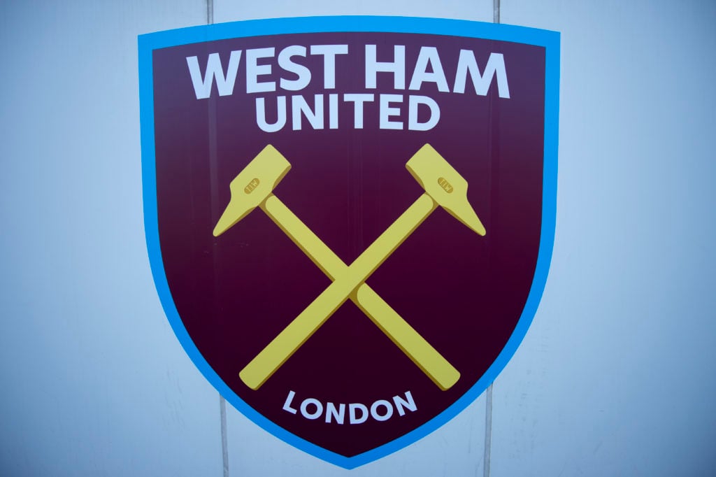
From the move to a stadium most supporters can’t stand to how the club has been run and even the infamous badge redesign which saw the word ‘London’ added to the West Ham crest.
That was hugely controversial when the Hammers changed the badge to coincide with the move from Upton Park to the London Stadium.
But amid poor results, turmoil and ever-growing unrest, a refreshed crest created by a sports branding designer will strike a chord with a fanbase that is desperate for something to feel good about.
Supporters have been bemoaning the latest club badge for nearly a decade now.
So many will see this concept design as a long-overdue nod to the club’s identity and traditions.
This is West Ham’s 130th anniversary year and a change to this crest would have been a great way to mark it.
Fin Sutherns has posted images from his work titled ‘2025 / West Ham United, reimagined’.
It brings back the classic castle turret in a modern yet retro refresh which is going down a storm with supporters.
You can check out the brilliant badge redesign in the post below.
Brilliant West Ham badge redesign brings back turret
“This project started from a clear observation: modern football crests are losing their soul,” Sutherns said on Instagram.
“Across the game, clubs have flattened, simplified, and sanitised their identities in the name of “digital-first” thinking – and supporters have noticed. Fans consistently react against these changes, describing new crests as generic, corporate, and emotionally empty.
What would YOUR ideal January transfer window look like? 💰
And which changes would you make to our XI?

“West Ham’s 2016 rebrand reflects that wider trend. While technically clean and functional, oversimplification has stripped away much of the character and nostalgia that supporters emotionally connect with. What’s left works on an app icon, but struggles to carry the weight of history and community.
“This concept pushes back against that thinking. The focus was on building on what Hammers fans knew and loved for years and years, preserving symbolism and restoring balance.
“The wider system shows how an identity like this can still function confidently in modern contexts – kits, transport, social, and more, without sacrificing personality. Digital compatibility doesn’t have to mean visual emptiness, and simplicity doesn’t need to come at the cost of meaning.”
The history of the West Ham badge mirrors the club’s journey from its industrial roots to a modern Premier League institution.
Founded in 1895 as Thames Ironworks FC, the club’s earliest crest reflected its origins in the Thames Ironworks and Shipbuilding Company.
While there was no formal badge in the early years, the identity of the team was closely tied to the tools of the trade that defined the workforce – most notably the hammers.
After the club was reformed as West Ham United in 1900, the crossed hammers became firmly established as the club’s symbol. They represented the shipbuilders and metalworkers of East London and quickly became synonymous with the team’s identity.
Hammers owners made hugely controversial badge change for stadium move
The hammers were sometimes accompanied by a castle, inspired by Green Street House, also known as Boleyn Castle, which stood close to the club’s Upton Park home. Throughout the mid-20th century, West Ham’s badge evolved in style rather than substance. Versions featuring the crossed hammers alone were often used on shirts, while official crests included the castle and the club’s full name.
The 1950s and 1960s, a golden era on the pitch, helped cement the badge as an iconic symbol of tradition, toughness and local pride. In 1987, West Ham introduced one of their most recognisable modern crests, refining the castle and hammers into a cleaner, more contemporary design. This badge remained largely unchanged for nearly three decades, becoming deeply associated with generations of supporters.
The most significant and controversial change in the history of West Ham’s badge came in 2016, though, ahead of the move to the London Stadium.
The club removed the castle, leaving the crossed hammers inside a shield with “West Ham United” prominent above them and the word ‘London’ added, with vice-chair Karren brady admitting it was to help with branding.
Receive a digest of our best West Ham content each week direct to your mailbox